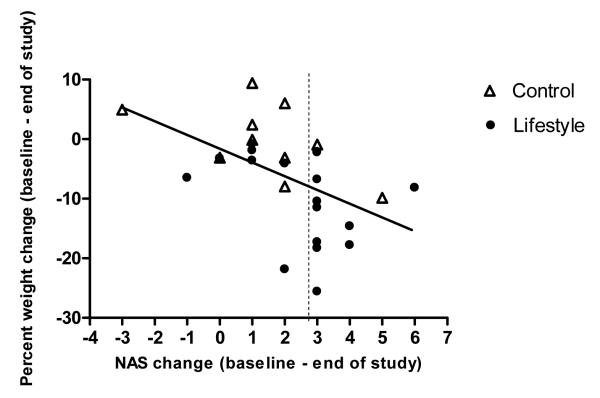
Figure 4.
Scatterplot with slope line depicting change in participant NASH Activity Score (NAS) as a function of their percent weight change. The slope line shows the trend (r=−.497, p=0.007) for participants who lost more weight to change more NAS points. Each point on the graph represents one study participant. Solid circle indicates Lifestyle intervention group. Triangle with no fill indicates Control group. Points to the right of the dashed vertical line indicate those who achieved the study end point of a 3 point reduction in NAS (study end point)

