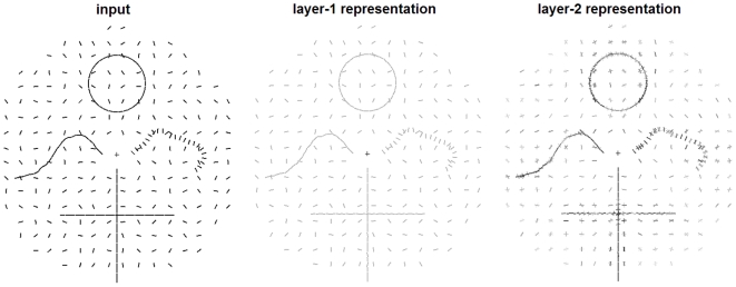
Figure 7. Simulation results showing how our model responds to visual contours.
Left image: input stimulus, consisting of a set of oriented line segments comprising several contours within a noisy background. The ‘+’ symbol indicates the center of the visual field and was not part of the stimulus. Central image: a visualization of the stimulus representation in the first layer of our model, which is a noisy version of the input. The contrast of the bars is set to the median of the contrasts in the right image. Right image: a visualization of the decoded stimulus representations after integration. At every original input location, the post-integration population code was decoded to a mixture of normal distributions. The contrast of each bar is proportional to the associated mixing proportion. Note the highlighting of the contours and the crowding effects in the periphery, which agrees well with the subjective experience when viewing the input stimulus.

