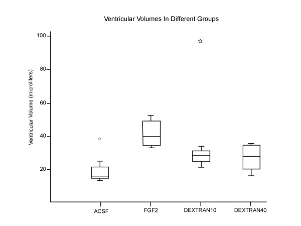
Figure 2.

Box plot showing the ventricular volumes in μL for the different infusion groups. The center line of the boxplot is the median value with the upper and the lower margins of the box representing the upper quartile (75th percentile) and the lower quartile representing (25th percentile). The upper and lower fences represent the value equal to 1.5 times the difference between the lower and upper quartiles (interquartile ratio). The outliers are represented by a mark outside the box plot. Note that all the infusions resulted in enlarged ventricles except for ACSF, and were significantly different from the ACSF group (I vs II p = 0.002, I vs III p = 0.009, and I vs IV p = 0.023). Note: Two outlying symbols represent ventricular size of animals in the ACSF and 10 KD dextran group that were much larger than the rest of the group.
