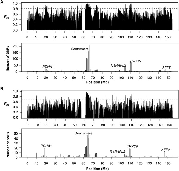
Figure 1.

Spatial Distribution of FST on the X Chromosome
The top panels in (A) and (B) show the distribution of single locus estimates of FST in the HapMap and Perlegen data, respectively. The dashed horizontal lines denote the 99th percentile of the empirical FST distribution. The barplots in the bottom panels of (A) and (B) represent counts of high-FST SNPs that fall in nonoverlapping 1 Mb bins in the HapMap and Perlegen data, respectively. The five clusters discussed in the text are labeled.
