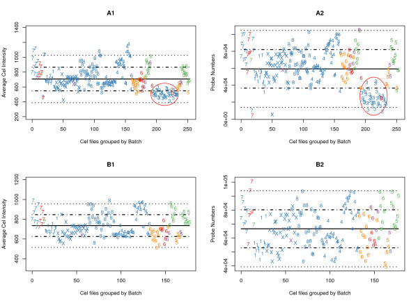
Figure 3.
BaFL Sample Batch Analysis. Graphical depiction of array/batch characteristics for samples in the Bhattacharjee experiment, with array-wide mean fluorescence and mean number of contributing probes, after exclusion of probes that lie outside the scanner detection linear range. The top pair (A1 and A2) shows the complete data set while B1 and B2 show the effect of removing batch 3 and outliers. The y-axis is the mean intensity per probe (A1 and B1) or the number of probes in the linear response range (A2 and B2) and the x-axis is number of samples; batches have been clustered together and are indicated by the numeral on the graph (there are no batches 2 or 9). The mean value across the samples is shown (solid line) and the 1st and 2nd standard deviations from the mean are shown (dotted lines). The numeral shown indicates to which batch the sample belongs (10 is X), the color indicates disease class (blue = Adenocarcinoma, red = Normal, purple = Small Cell Carcinoma, green = Pulmonary, and orange = Squamous). The red circle emphasizes the divergent behaviour of batch 3 in both tests. The same analysis for the Stearman data is given as Additional file 2[19].

