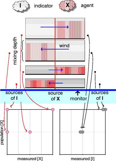
Fig. 3.

Pollution climate of Line City. Blue bar maps the linear arrangement of emissions sources and monitor. Rectangles above the bar show x–z distributions of atmospheric concentrations under four different meteorological regimes. Curved arrows link individual meteorological regimes to individual points in graphs below the bar. These graphs plot city-average concentrations of the harmful agent X against monitored concentrations of X and the generic air quality indicator I
