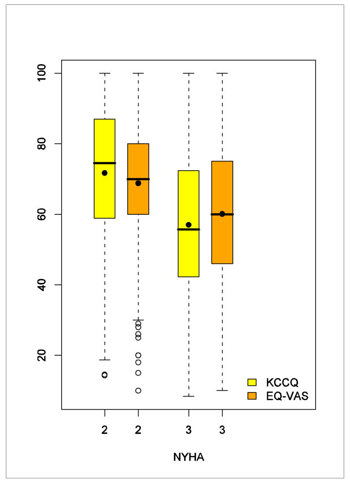
Figure 1. Side-by-Side Box Plot of the VAS and the KCCQ Overall Score by NYHA Class.
The upper and lower bounds of the boxes represent interquartile ranges. The lines dividing the boxes represent medians and the points inside represent means. The upper ends of the whiskers represent maximum observations; the lower ends represent minimum observations (NYHA = 3) or minimum observations above the lower fence of 1.5 interquartile range below the 25th percentile (NYHA = 2); and the open points represent extreme observations below the lower fence.

