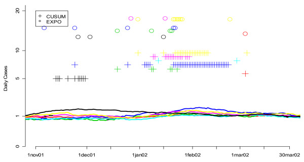
Figure 17.
Daily flags from the fine-tuned CUSUM and EXPO algorithms when applied to respiratory infection data from 7 hospitals during the winter of 2002. Smoothed values for the number of respiratory cases are shown for seven hospitals, each with a different color curve. The flagging of the detection algorithms is represented by symbols (+ for CUSUM, o for EXPO) plotted according to the day they flagged on the horizontal axis and along different fixed values on the vertical axis to help distinguish more clearly between the algorithms being compared.

