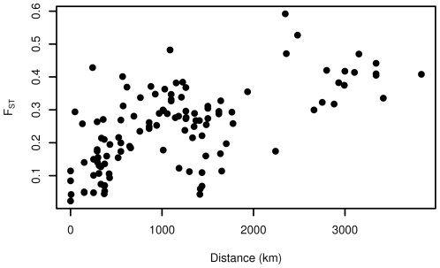
Figure 4. Relationship between geographic distance and genetic distance.
Each dot represents a comparison between 2 populations of at least 5 individuals. For populations where there were more than 5 individuals, estimates of  were bootstrapped to ensure that the larger sample size did not cause any bias in the estimate.

