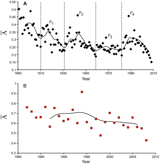
Figure 4. Average yearly  over time for each discipline.
A. Secular evolution of  for T&F (black dots); B. Evolution of
  for swimming (red squares). Both evolutions are given with a 60 Hertz, second order low pass Butterworth filter. Besides the initial era (1890–1910), 4 peaks (p1–p4) appear in T&F. Swimming curve (B) does not show any trend over the years. The 1994 peak is mainly related to Chinese swimmers, who performed very high performances (also observable in 1993 (p4) in T&F).

