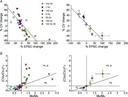
Figure 8. The relationship between CV and mean EPSC amplitude during LTP and LTD expression.
The plots show data obtained at different frequencies (1, 8, 50 and 100 Hz; same as in Figs 2 and 3) and burst durations (10 impulse bursts at 100 Hz; from Gall et al. 2005). Data obtained at 24°C are also shown. Single data points (left plots) and average data grouped per category (right). A, the plots show the relationship between CV and EPSC changes at different frequencies. During LTP, EPSC CV decreased and EPSC amplitude increased, while the opposite occurred during LTD. Linear regression over the points was statistically significant (slope −0.62 ± 0.10, intercept 7.92 ± 4.9; R2= 0.52; n= 38; P < 0.0001). B, the plots (CVB/CVA)−2vs. MB/MA show that most LTP-related points fall in the regions of increased quantum content, i.e. above the unitary diagonal for MB/MA > 1, while most LTD-related points fall in the regions of decreased quantum content, i.e. below the unitary diagonal for MB/MA < 1. Data in average plots are reported as mean ±s.e.m.

