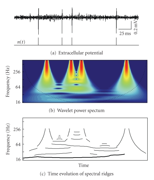
Figure 2.
Wavelet analysis of a spike train. (a) Conversion of extracellular recording into a spike train, n(t). (b) Energy density E(f, t) of the spike train (color from blue to red corresponds to the spectrum magnitude). Dashed black curve defines the cone of influence where the edge effects canot be neglected. (c) Time evolution of “spectral ridges” F k(t). Thick curve corresponds to the main (most prominent and stable) ridge, whose central frequency varies in time around 20 Hz.

