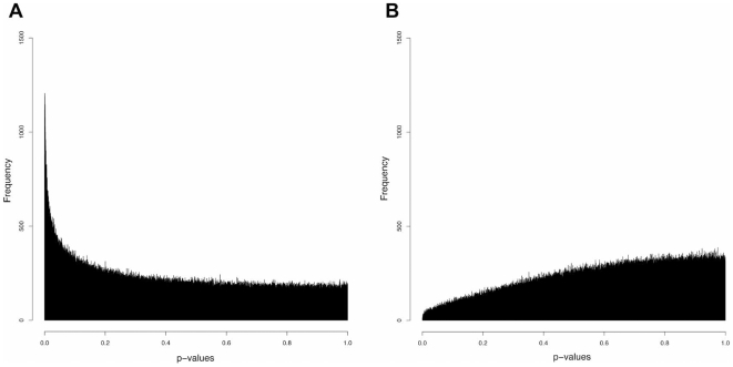
Figure 1. Supervised group comparisons reveal significant differences in HELP data results between IUGR and controls.
Panel (A) shows a histogram distribution of p-values calculated from an unpaired T test of IUGR (n = 5) in one group and controls (n = 5) in another. The x axis represents p values, with lower values being the more significant, while the y axis shows the frequency of occurrence of different p values. The peak observed represents a subset of loci with low p values and thus significant differences between IUGR and control subjects. For comparison, panel (B) shows the results of a random distribution of subjects into two groups, mixing IUGR and controls, demonstrating the absence of a subset of loci with significant p values.

