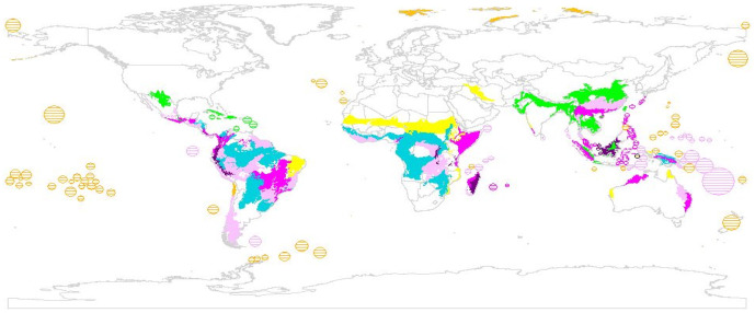
Figure 3. World map of ecoregions ranked according to species richness, endemism, ∂-endemism and threat.
The congruence of the 100 highest ranking ecoregions of each prioritization scheme is shown (endemism only: yellow, ∂-endemism only: orange; richness only: turquoise; two, three or all metrics: light, medium or dark purple, respectively). Small islands, which are too small to be seen on the map, are highlighted by hatching.

