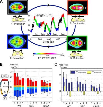
Figure 3.
Analysis of the four phases of the motility cycle using phase statistics. (A) Assignment of individual time points to the four phases of the motility cycle based on increasing length (black), maximal length (red), decreasing length (green), and minimal length (blue). Normalization yields average stress maps (color map) and cell shape (black-white-black outline) for each phase. The bar plots in B show average area fluxes during each phase as determined by phase statistical analysis. The insert sketch represents the contour of a cell at time t (solid line) and at time t + Δt (dashed) and illustrates the origin of each of the different area fluxes represented in the bar plots in this panel. Red stands for area increase in the front and yellow for increase in the back. Dark blue stands for area decrease in the back and light blue for area decrease in the front. (C) Area flux due to cell shape change (see Eq. 1) in yellow area flux attributable to continuous translocation in dark blue (see Eq. 2).

