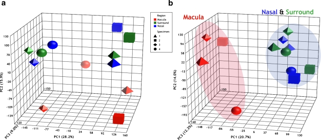
Fig. 4.
Principal component analysis of the microarrays. Each data point/shape represents a microarray, with all 12 arrays presented on the PCA plot before (a) and after (b) the batch effect filter was applied. Macula (red), nasal (blue), and surround (green) arrays are distinguished by color, and specimens 1 (tetrahedron), 2 (cube), 3 (octahedron), and 4 (sphere) are distinguished by shape. Once the data are adjusted for batch (b), macula arrays aggregate to the left and nasal and surround arrays aggregate to the right of PC 1 (X-axis). The macula array of specimen 4 shows some separation from the other macula arrays along PC 2 (Y-axis). Given PC 1 describes the largest amount of data variance (20.7%), the aggregation of the arrays is mostly accounted for by sample location. The percentage values in parentheses indicate the proportion of total variance described by each PC. PC 1 principal component 1 (X-axis); PC 2 principal component 2 (Y-axis); PC 3 principal component 3 (Z-axis)

