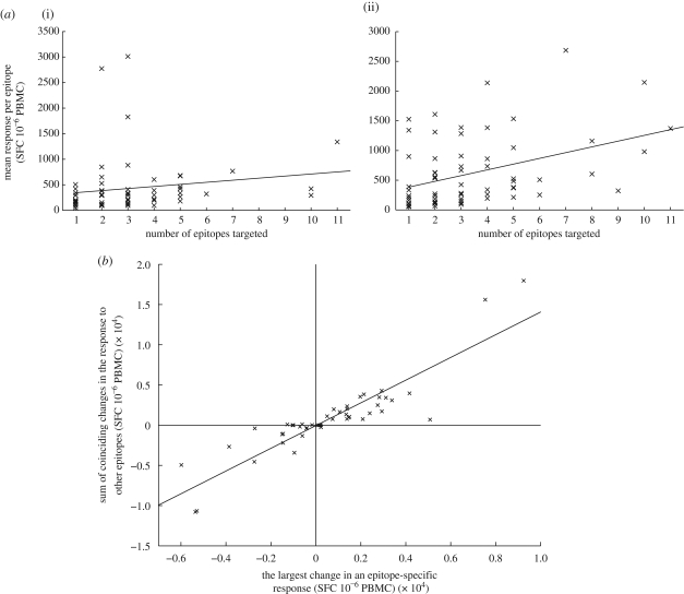
Figure 2.
Observations from the SSITT data. (a) Patients with more responses make larger responses. A scatter plot and fitted line showing that there is a positive correlation between the mean response per epitope and the number of epitopes targeted for samples taken at (i) week 0 (not significant; PCC = 0.167, p = 0.191) and (ii) week 19 (significant; PCC = 0.405, p = 0.001), the two weeks with the most number of patients sampled (week 0, n = 73 and week 19, n = 69). When the same analysis was performed on the response data from each of the 29 different sampling times, a positive correlation was found at 26 sample times. Twelve of the positive correlations and none of the negative correlations were significant. The full analysis is presented in figure S1 in the electronic supplementary material. (b) A large change in one epitope-specific response is accompanied by changes in the same direction in other responses. A scatter plot and fitted line showing how the largest change in response directed against a single epitope corresponds to changes in the response directed against other epitopes. There is a striking positive correlation between these two variables (PCC = 0.897, p < 0.001), i.e. responses to different epitopes increase in unison or decrease in unison. Only changes corresponding to week 50 and beyond were included in this analysis. The data from each patient are represented by a single cross. The same pattern is observed when data from all sample times are analysed (PCC = 0.690, p < 0.001; data not shown).

