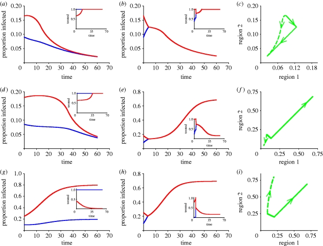
Figure 1.
Comparison of disease progress curves for the (a,d,g) best and (b,e,h) worst policies. (a–c) Progress of disease in two interconnected regions 1 (blue curves) and 2 (red curves), with treatment dynamics in insets, showing small differences between the best and worst paths when initial infection occurs in zone A (table 1). (d–f) The best and worst paths diverge markedly when initial infection occurs in the instability zone B (table 1). (g–i) Disease continues to increase but markedly less steeply in the region with the lower infestation (region 1) when infection occurs in zone C (table 1). Default parameters are α=0.25 (efficiency of control), β=0.25 (within-region transmission rate), γ=0.03 (between-region transmission rate), r=0.1 (discount rate), μ=0.05 (recovery rate), M=0.2 (fixed costs) with N=1 ((c,f,i) proportion infected).

