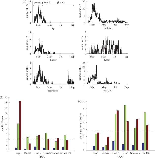
Figure 1.
(a) Temporal pattern of IPs in the five DCCs with the greatest number of IPs (and in the rest of the UK), (b) non-IP to IP ratio and (c) pre-emptive cull to IP ratio, for these DCCs during the three phases of the epidemic. (b,c) The dashed lines show the non-IP to IP ratio and the pre-emptive cull to IP ratio respectively for the whole country, averaged over the entire epidemic. Blue bar, phase 1; green bar, phase 2; brown bar, phase 3.

