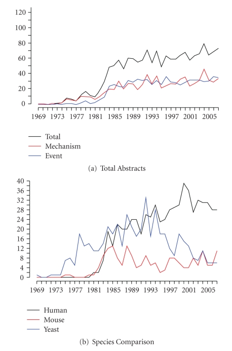
Figure 1.
Trend Analysis Graphs. These graphs show the chronological trend of the tagged abstracts. For all graphs, the x-axis represents years and the y-axis represents the amount of tagged abstracts published in that year. Graph (a) represents the total abstracts published in each year and the breakdown into mechanism abstracts and event abstracts. Graph (b) shows a comparison between the three most studied species: human, yeast, and mouse.

