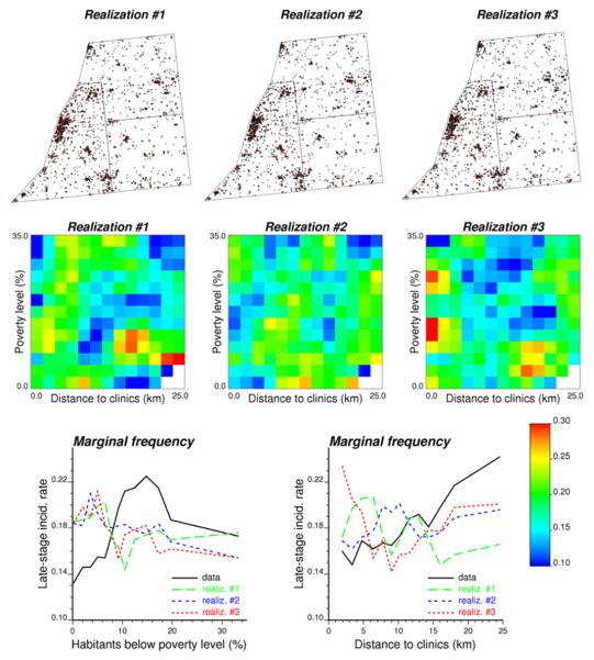
Fig. 4.
Location of patient residences and the simulated stage at diagnosis (x = early stage, ● = late stage). Frequency tables and marginal frequency plots are generated for each of the three simulated maps and compared to results obtained from actual data in Figure 2 in order to compute the p-values of the tests of hypothesis.

