
Figure 1. Levels of Efficiency in Allocating Health Care Resources.
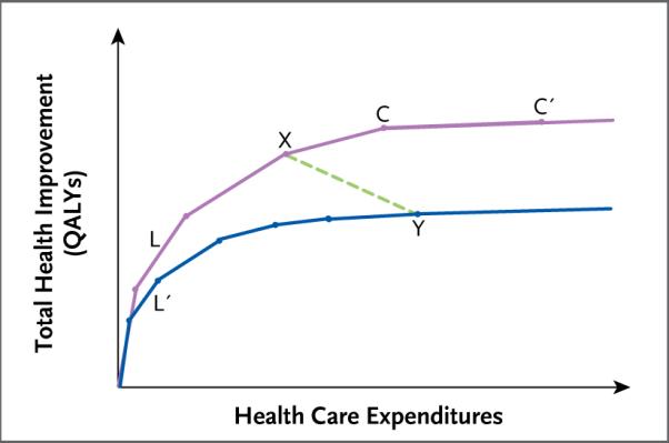
Shown is the relationship between expenditures and health gains (as measured in quality-adjusted life-years [QALYs] gained) in two hypothetical health care delivery systems. The purple upper curve represents an allocation of expenditures to health interventions that maximizes health improvements for any level of expenditure. The blue lower curve represents an allocation that is inefficient in the sense that it falls short of the maximum attainable health gain for any level of expenditure. The line segments that make up the curves represent incremental additions of health interventions or substitutions of more beneficial but more expensive interventions for less expensive but less beneficial alternatives. For example, line segments L and L′ both represent a hypothetical intervention that is very cost-effective relative to the other interventions to the right. However, in the inefficient allocation (lower curve), this highly cost-effective intervention is underutilized, as represented by the shorter length of L′ as compared with L. The line segments become progressively less steep from left to right, reflecting diminishing health value as expenditures increase. The points on the curves represent possible allocations of health expenditures. For example, point X on the upper curve represents an allocation that achieves more health gains at a lower cost than the allocation represented by point Y on the lower curve. The shallow slope of the line segment connecting points C and C′ reflects the fact that the intervention it represents is a relatively cost-ineffective one, although it is still beneficial.