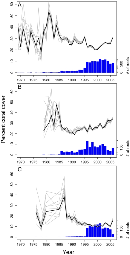
Figure 2. Comparisons of the average coral cover per year as predicted by the models.
Simulated data sets (light grey lines) with the observed mean coral cover per year (thick black line) for (A) MPA versus control model, (B) MPA-only Caribbean years of protection model, and (C) MPA-only Indo-Pacific years of protection model. The histograms at the bottom of the figures display the relative sample sizes at each year for the actual data. In all models, the earlier years had less data and therefore exhibit more variation in behavior. In the ‘year of protection’ models there was not sufficient data to accurately estimate percent coral cover so the simulation results begin in later years. Note that the right y-axes are different in each of the plots due to the varying number of observations in each model.

