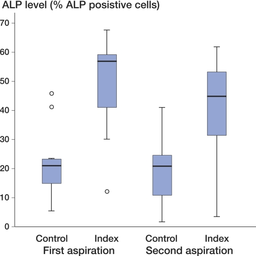
Figure 7.
ALP induction per donor. The y-axis shows the percentage of ALP-positive cells gated in flow cytometric analysis. Box plots show the mean ALP levels for triplicate measurements from all donors combined for each modality. The range, first and third quartile, and the median are shown. Outliers are depicted separately (o). One-way ANOVA followed by Tukey's post hoc test showed no significant differences between the ALP levels of the first and second aspirates.

