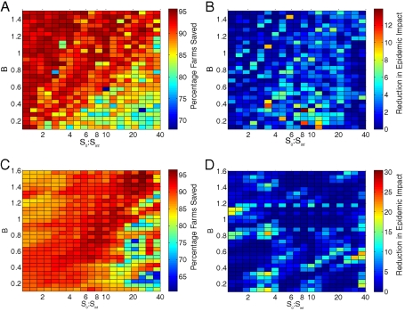
Fig. 3.
Using the full clustered data, these graphs show the impact of ring culling at the true (RT) and approximated (RRR) optimal radius, as the distribution of farms controlled by the parameter B and the ratio S0∶Sinf vary. In (A) and (B), the random-location model is fitted to the entire epidemic derived from a simulation using the spatially clustered location data, while in (C) and (D), only the first 14 days of the epidemic are used to fit the random-location model. In (A) and (C), the color scale gives the percentage of farms that would be saved by additional ring culling at radius RRR compared with IP and DC culling alone. In (B) and (D), the color scale gives the additional saving in the epidemic impact when ring culling at the true optimal radius (RT) is compared with at RRR.

