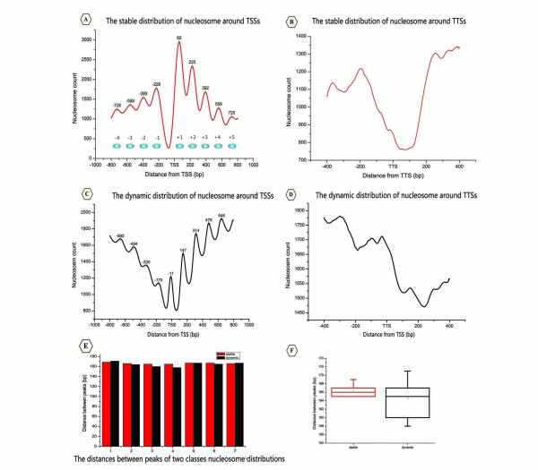
Figure 4.
Two distinct distribution domains around the TSS and the TTS. (A) The stable nucleosome distribution profile around the TSS. The digital values represent the coordinates of peaks relative to the TSS. (B) The stable nucleosome distribution profile around the TTS. (C) The dynamic nucleosome distribution profile around the TSS. The data represent the locations of peaks from the TSS. (D) The dynamic nucleosome distribution profile around the TTS. (E) The distances between peaks. Red bars represent the span of stable nucleosome profile peaks, whereas black bars indicate the span of dynamic nucleosome profile peaks. (F) Box plot of average peak distances. The red box represents the stable nucleosome, while the black box represents the dynamic nucleosome.

