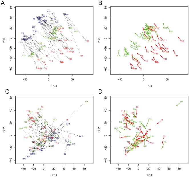
Figure 2. Analysis of DNA methylation patterns in blood, normal esophageal tissue, and tumors.
The analysis is similar to Figure 1 except that we include 30 tumors from the same individuals. Figure 2A shows the PCA using methylation measurements. Three clusters are evident, corresponding to blood, normal, and tumor samples. Samples are labeled with blue (patient blood, letter B), green (patient normal, letter N), and red (patient tumor, letter T). Figure 2B shows unit length direction arrows of the same data as Figure 2A. The green arrows emanate from normal and point to blood samples whereas the red arrows start from tumors and point to blood samples. Figure 2C shows similar PCA using quantitative DNA measurements. Data processing and analysis is similar to Figure 2A. The DNA measurements serve as a control for variation in the samples. Figure 2D shows the plot of arrows using the data from Figure 2C. It is evident that the arrows in Figure 2D (for DNA) are randomly orientated due to different PC1 and PC2 scores between different tissues from a single individual.

