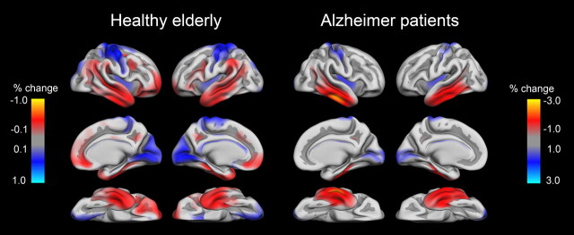
Figure 3.
Regional rates of atrophy relative to mean atrophy within group for healthy elderly and AD. To visualize the areas that showed more than average atrophy and the areas that showed less than average atrophy within each group, mean cortical volume reduction was calculated for each hemisphere in each group. This value was subtracted from the surface maps, yielding a new map highlighting areas that show greater (red) and lesser (blue) rates of atrophy than average for that group. As can be seen, in healthy elderly (left), higher than average volume reductions are seen in lateral temporal, inferior parietal, supramarginal, and frontal cortices. In contrast, the AD patients show higher than average atrophy mainly in the temporal lobe (middle and inferior temporal gyri, fusiform gyrus). Please note that to allow optimal visualization of regional variation, the color scale is different for the healthy elderly and the AD groups.

