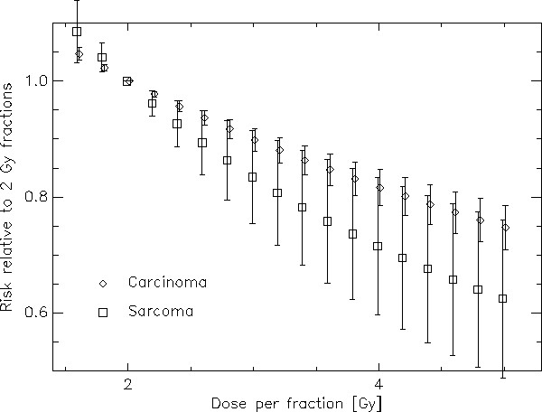
Figure 4.

Risk ratio between treatments with different fractionations relative to a 2 Gy fractionation schedule plotted as a function of dose per fraction. The diamonds represent carcinoma and the squares sarcoma induction. The bars represent the variation of risk difference for the different dose levels including tissues which receive nearly no dose up to the target dose.
