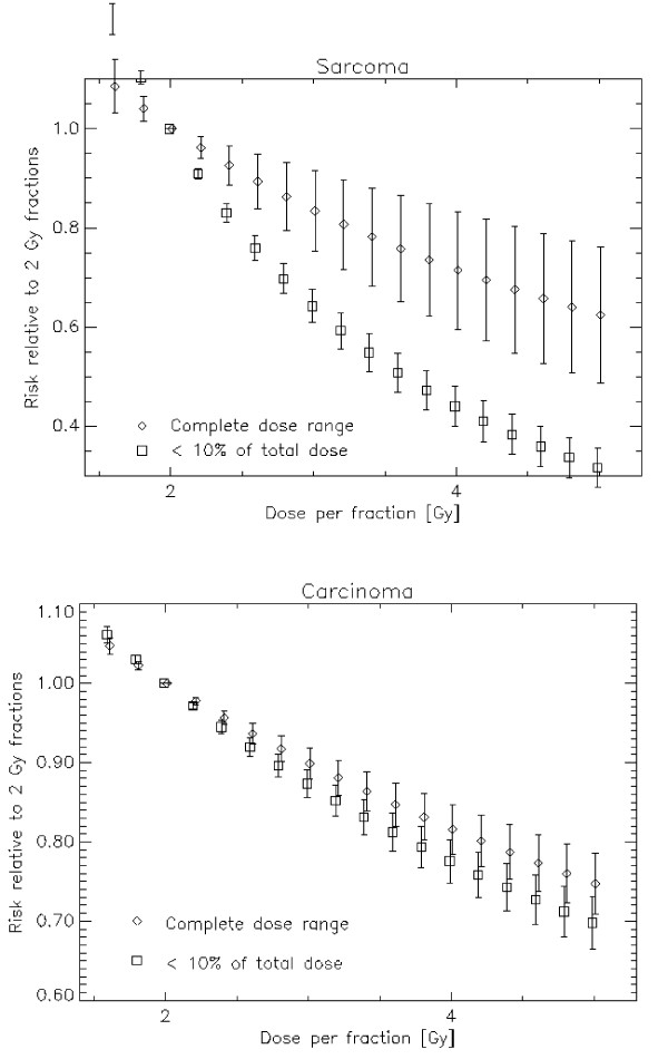
Figure 5.
Risk ratio between a treatments with different fractionations relative to a 2 Gy fractionation schedule and plotted as a function of dose per fraction. For sarcoma in a) and for carcinoma in b). The diamonds represent the average over the whole dose range and the squares are averages up to 10% of the target dose which is 5 Gy NTD2 in this example. The bars represent the variation of risk ratio over the dose range.

