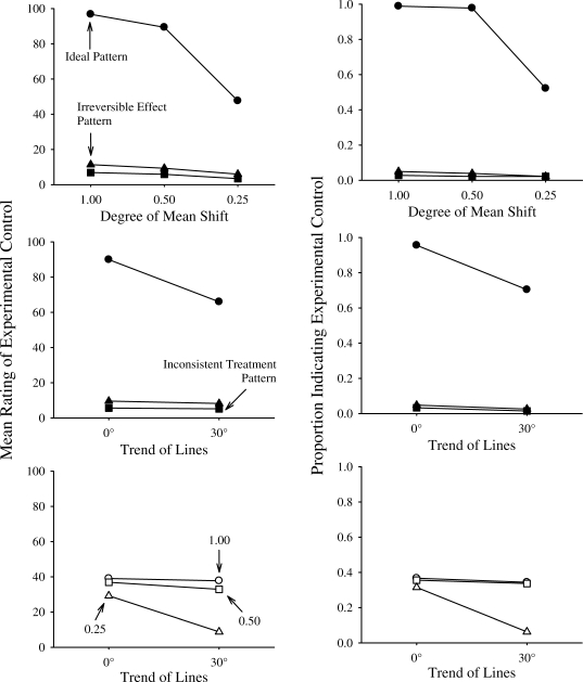
Figure 2.
Top panels depict the Pattern × Mean Shift interaction in the prediction of raters' assessment of experimental control. The top left panel plots means and corresponds to results from the ANOVA analyses. The top right panel plots proportions and corresponds to results from the generalized linear models. The center panels depict the Pattern × Trend interaction in the prediction of raters' assessment of experimental control. The center left panel plots means and corresponds to results from the ANOVA analyses. The center right panel plots proportions and corresponds to results from the generalized linear models. The bottom panels depict the Degree × Trend interaction in the prediction of raters' assessment of experimental control. The bottom left panel plots means and corresponds to results from the ANOVA analyses. The bottom right panel plots proportions and corresponds to results from the generalized linear models.

