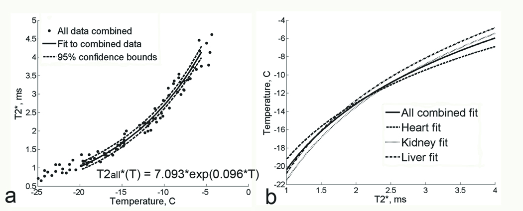
Figure 5.
a. Plot of T2* measurements as a function of temperature at 0.5T, for all tissue types combined together. Solid line represents the exponential fit to combined data;. 95% confidence bounds are shown with dashed lines. b. Plot of T2* fits for the individual tissue types (dashed lines) and for all tissue data combined (solid line). T2* is on the X axis and temperature is on the Y axis here to illustrate an example temperature calibration curve.

