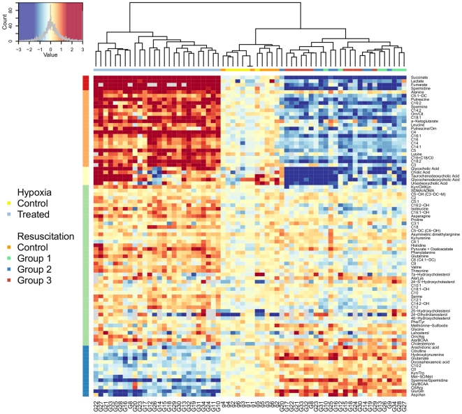
Figure 3. Visualization of individual metabolite concentration ratios.
The heat-map is a graphical representation of the true metabolite concentration changes in a two-dimensional, rectangular and colored grid. Metabolites are given on the y axis (i.e., row), animal profiles are given on the x axis (i.e., columns) and each “pixel” represents a metabolite change (in log basis 2 scale) between two consecutive time points. With regard to the design, each animal (as labeled by G/g) is thus represented twice: one cell for each change corresponding to the hypoxia (i.e., EA/SA) and to the resuscitation (i.e., ER/EA) steps. For a more comprehensive visualization, metabolite changes are centered around a common value, and both rows and columns are reordered so that meaningful characteristics of the data can be uncovered without any a priori knowledge about the experimental design. First, concentration changes for each metabolite (row) are centered around the average change found in the sham animals (i.e., control animals labeled by g). Following the left corner diagram, red (resp. blue)-colored cells indicate a higher (resp. a lower) change in concentration than the average change observed for the control animals. Cells for which changes are greater than 3 (c.a. 2∧3 = 8 fold change) and lower than −3 (c.a. 1/8) are coded in the darkest red and blue. Column reordering proceeds by placing observations (i.e., EA/SA or ER/EA from one animal) with the most similar profiles, using hierarchical clustering agglomeration in which the leaves represent individual observations and in which the height of the nodes reflects the dissimilarity between the two clusters of observation. Animal labels are given at the bottom, whereas a square color-coded according to its treatment group is at the top of the heat-map. Three clusters, corresponding to the profiles from the asphyxiated animals (left) followed by the sham animals (center) and profiles associated to resuscitation (right), are clearly observed. However, unsupervised clustering cannot efficiently group animals according to their reoxygenation protocol (right). Finally, metabolites (i.e., rows) are grouped according to their intensity patterns, with their partitions displayed on the left side. The upper part of the heat-map comprises metabolites that are increased during asphyxia and decreased during resuscitation, whereas the lower part regroups compounds with the opposite behavior.

