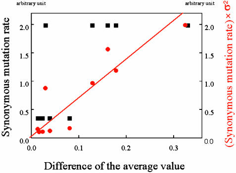
Fig. 3.
σ2 (variance of fluorescence intensity) multiplied by Δa (synonymous mutation rate) is plotted vs. the change of average fluorescence intensity as red circles by using the data from Fig. 2. The red line is a linear fit to the data, which turn out to pass through the origin. For reference, the synonymous mutation rate Δa vs. the change of average fluorescence intensity value is also plotted as black squares. The correlation coefficient for the linear fit is 0.79, whereas that for the synonymous mutation rate (black squares) is 0.21.

