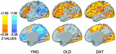
Fig. 2.
Statistical activation maps for young, old, and DAT groups. Warm colors (red, yellow) show positive activations; cool colors (blues) show deactivations. Brighter colors indicate areas of greater statistical significance. (Upper) The left lateral cortical surface for each group. (Lower) The right medial surface. These maps complement the a priori statistical analyses shown in Fig. 1. Because different numbers of subjects contribute to each of the maps in the current figure, apparent differences in z scores across the groups should not be quantitatively interpreted.

