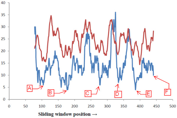
Figure 2.

Comparative graphical representation of aa segment variability and ASA. In this graph Average Solvent Accessibility (ASA) (in brown) is compared with GSWM generated amino acid segment variability (in blue). The y-axis represents both the variability and solvent accessibility. The x-axis represents the sliding window middle position number.
