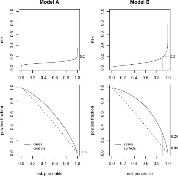
Figure 3.
An alternative way to display the risk distributions shown in Figures 1 and 2 with the integrated plot (4). The integrated plot displays the risk quantiles in the upper panels together with true and false positive rates associated with corresponding risk thresholds in the lower panels. Values corresponding to the risk threshold riskH =0.20 are shown.

