Figure 6.
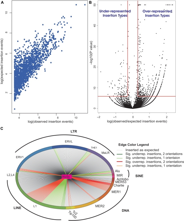
Insertion pattern of new TEs into older TEs in intergenic regions of the human genome. (A) Correlation between observed and expected values of the different insertion types. Insertion types with more than 10 observed insertions are presented. (B) The volcano plot shows the observed/expected insertion ratios for insertions of new TEs into old TEs and the statistical significance of these ratios. Each point represents insertions of a new TE into an old one in a single orientation (sense/antisense). Points in the upper right rectangle are considered overrepresented with P < 1.37 × 10⁻⁶ (P < 0.05 after Bonferroni correction for 36 478 tests) and observed/expected ratio >2. Points in the upper left rectangle are considered under-represented with Bonferroni adjusted P < 1.37 × 10⁻⁶ and observed/expected ratio <0.5. Points of P < 10−50 were considered, for visualization purposes, as P = 10−50. (C) Insertion pattern of AluSx into old TEs. In this star graph, AluSx is the central vertex and is connected by edges to 299 vertices, representing the distinct old TE types into which AluSx could have inserted in unique intergenic regions. All TEs from the same family have a common vertex color and all families belonging to the same repeat class have close colors (e.g. SINEs are purple-pink). The edge color represents whether the insertion type was roughly as expected, under-represented or overrepresented in intergenic regions. Edge color also indicates the number of orientations in which over-/under-representation exists: sense, antisense or both. Sig. indicates statistically significant; underrep. indicates under-represented; overrep. indicates overrepresented.

