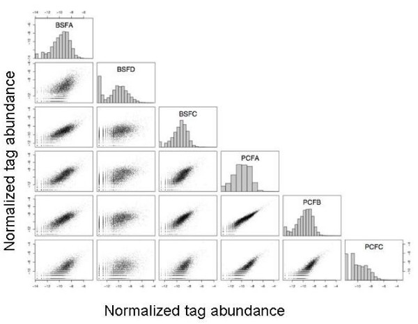
Figure 1.
Scatterplot showing the correlation between the expression levels for each gene for each library. Scatterplots of the normalised tag abundance (transformed using loge(tag abundance + 1)) for each library in all pairwise combinations. Histograms show the distributions of the transformed normalised abundances.

