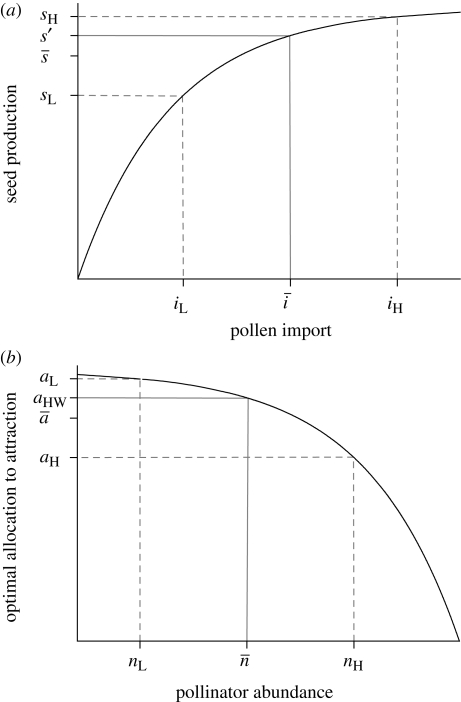
Figure 2.
Graphical models of the effects of (a) variation in pollen import (i) on mean seed production (s; based on Richards et al. 2009) and (b) variation in pollinator abundance (n) on the expected optimal allocation to pollinator attraction (a; inspired by Burd 2008). The black curve in each panel depicts the relation of the dependent to the independent variable. The solid grey line maps the mean independent variable into the corresponding value of the dependent variable and the dashed grey lines map low (L) and high (H) values of the independent variable that are equally spaced below and above the mean independent variable. Because seed production increases nonlinearly with pollen import, mean seed production for variable pollen import ( ) is less than the fecundity expected given the mean pollen import (s′), both of which are lower than the maximum possible seed production, indicating PL. Richards et al. (2009) referred to the difference between s′ and
  as variance limitation. Similarly, because the optimal allocation to pollinator attraction declines nonlinearly with pollinator abundance, the average optimal allocation to attraction (
 ) is less than the optimum expected for average pollinator abundance (aHW), which is equivalent to the balance between pollen and resource limitation predicted by Haig & Westoby (1988), resulting in chronic PL.

