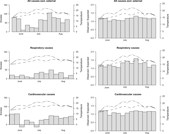
Fig. 2.
To the left; excess admissions during summer 2006 as observed minus expected, and to the right; ratios of observed to expected, with expected as predicted from a regression model based on patterns during the two preceding years. The dot-dashed lines correspond to weekly mean temperatures during summer 2006 and the dashed lines to the weekly mean temperatures during the two preceding summers.

