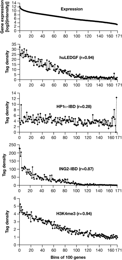
Fig. 1.
Gene expression and integration site preferences. Top: The uppermost panel (Expression) represents >17,000 well-characterized mouse genes placed into bins of 100 according to the level of expression measured in the MEF-KO cells. The average level of expression for the genes in each bin is given on the y axis (log2 scale). Bottom: Distribution of H3K4me3 marks from the data of Barski et al. (30) plotted against bins of 100 genes according to the level of expression in human CD4+ cells. Upper Middle, Middle, Lower Middle: These three panels show, on the y axis, the number of integrations in each bin of 100 genes for LEDGF and the two CBD–IBD fusions. The genes were placed in bins according to their level of expression in MEF-KO cells, shown in the uppermost panel. The integration data have been normalized to a total of 10,000 integrations. The data for the ING2 PHD finger fusion were based on the number of integrations within 2.5 kb of a TSS for the 100 genes in each bin, so each point represents the number of total integrations in 0.5 Mb. For huLEDGF and the HP1α chromodomain fusions, which direct integrations throughout genes, we first enumerated the total number of integrations in all of the genes in each bin. Because the size of the genes varies (highly expressed genes tend to be smaller), the total target size in different bins also varies. To solve this problem, the data were renormalized on the basis of a total target size of 1 Mb in each bin. This means that the ING2 fusion data cannot be directly compared with the HP1α fusion and huLEDGF data (see text). Note that the various panels have different scales on the y axis.

