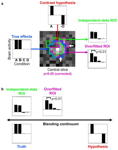
Fig. 3. Example 2: ROI definition can bias activation analysis.
A simulated fMRI block-design experiment demonstrates that nonindependent ROI definition can distort effects and produce spuriously significant results, even when the ROI is defined by rigorous mapping procedures (accounting for multiple tests) and highlights a truly activated region. Error bars indicate +/− 1 standard error of the mean. (a) The layout of this panel matches the intuitive diagrams of Fig. 1a: The data in Fig. 1a correspond to the true effects (left); the assumptions to the contrast hypothesis (top), and the results to ROI-average activation analyses (right). A 100-voxel region (blue contour in central slice map) was simulated to be active during conditions A and B, but not during conditions C and D (left). The t map for contrast A-D is shown for the central slice through the region (center). When thresholded at p<0.05 (corrected for multiple tests by a cluster threshold criterion), a cluster appears (magenta contour), which highlights the true activated region (blue contour). The ROI is somewhat affected by the noise in the data (difference between blue and magenta contours). The noise pushes some truly activated voxels below the threshold and lifts some nonactivated voxels above the threshold (white arrows). This can be interpreted as overfitting. The bar graph for the overfitted ROI (bottom right, same data as used for mapping) reflects the activation of the region during conditions A and B as well as the absence of activation during conditions C and D. However, in comparison to the true effects (left) it is substantially distorted by the selection contrast A-D (top). In particular, the contrast A-B (simulated to be zero) exhibits spurious significance (p<0.01). When we use independent data to define the ROI (green contour), no such distortion is observed (top right). For details on the simulation and analysis, see Example 2: Regional activation analysis in the text. (b) The simulation illustrates how data selection blends truth (left) and hypothesis (right) by distorting results (top) so as to better conform to the selection criterion.

