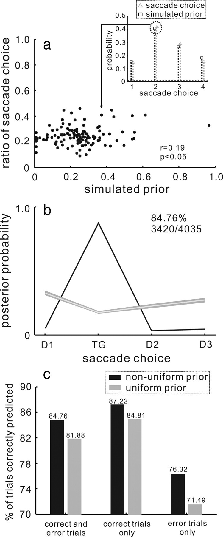
Figure 4.

The influence of the prior in predicting a saccade choice. a, The ratio of the saccade choice is plotted against the simulated prior probability. One example of choice distribution and the simulated prior distribution appears in the inset (black dotted line and squares = simulated prior; gray dotted line and triangles = the distribution of saccade choices). To show the relationship between the distribution of saccade choices and the simulated prior distribution, two points from the inset were remapped to the plot of points shown in a. This was done for all 120 datasets, so n = 120 points. The Pearson correlation coefficient was determined, r = 0.19. This relationship was small but statically significant (p < 0.05) b, The mean of the MAP estimates across all trials, computed using the empirical PDD, and the nonuniform prior distribution is plotted for the four possible saccade choices. The black line shows the mean of the MAP estimates for the trials in which the model estimate correctly predicted the saccade choice. The gray line shows the mean of MAP estimates across all the trials in which the model estimate did not predict saccade choice correctly. Shading around the lines indicates 1 SE. This version of MAP model predicted the saccade choice correctly on 3420/4035 (84.76%) trials. c, The percentage of trials predicted correctly from the MAP model is plotted for the models using the uniform (gray bars) and nonuniform (black bars) prior distribution. The trials are sorted by whether they were correct or in error. The percentages in each condition appear on the top of each bar.
