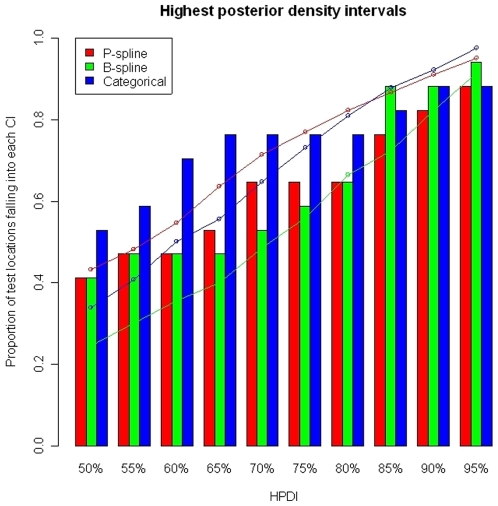
Figure 5. Percentage of test locations with malaria prevalence falling in the predicted highest posterior density intervals (bar plots).
The wideness of the predicted highest density regions (line plots). Non-linear environmental effects are modeled via P-splines (red), B-splines (green) and categorizing the covariates (blue).

