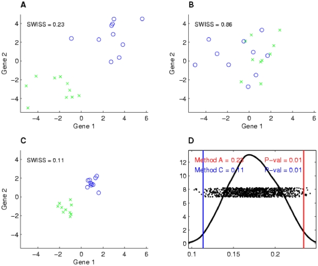
Figure 1. Toy example demonstrating how SWISS measures clustering.
Two-dimensional toy example, with the same axes in plots A–C. The two classes are distinguished by different colors and symbols. Suppose that the same dataset has been processed using three different methods, with the processed data shown in A–C. This toy example demonstrates that data that are clustered better (A and C) have a lower SWISS score than data where there is not much separation between classes (B). This also shows that SWISS scores can be compared even when the data are on different scales (A vs. C). Plot D shows the SWISS permutation test of the data shown in plots A and C. This plot shows the distribution of the permuted population of SWISS scores (black dots), summarized by a smooth histogram (black curve), along with the SWISS scores of Method A (red vertical line) and Method B (blue vertical line). The SWISS scores and corresponding empirical p-values are also reported. Because both p-values are less than 0.05, we conclude that the processing method shown in C is significantly better than the processing method shown in A.

