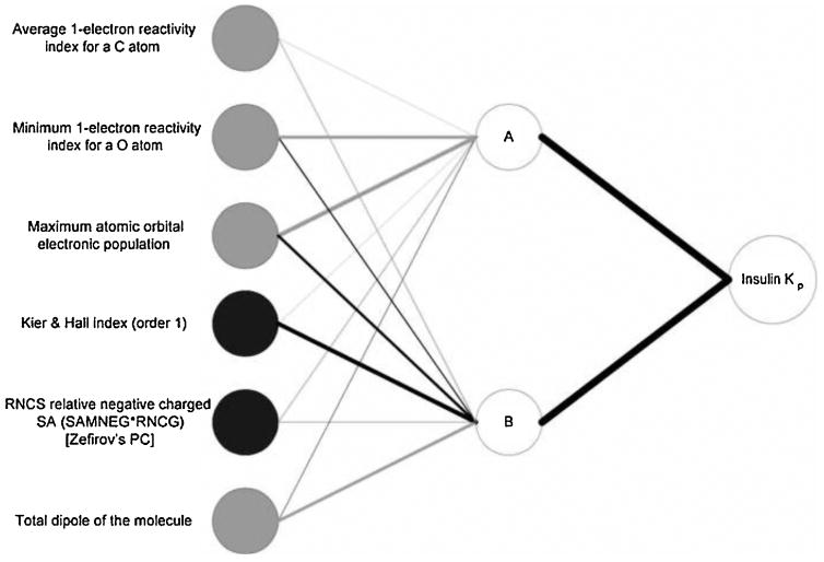
Figure 6.
Neural interpretation diagram (NID) for the optimal neural network. The thickness of the connecting lines is proportional to the magnitude of the weights between the neurons. Black lines indicate positive weights and grey lines indicate negative weights. Black input circles indicate inputs that have an overall positive effect on the output and grey input circles indicate those that have an overall negative effect.

