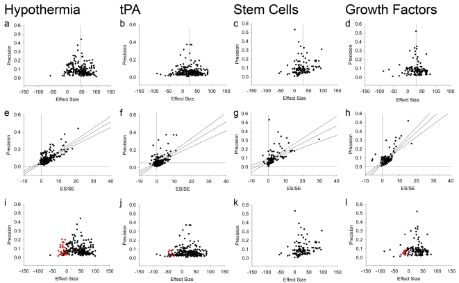
Figure 2. Example funnel plots, Egger regressions, and trim-and-fill plots.
Data from meta-analyses of hypothermia (a,e,i), tPA (b,f,j), stem cells (c,g,k), and growth factors (d,h,l). (a–d) Funnel plots showing precision plotted against effect size. In the absence of publication bias the points should resemble an inverted funnel. (e–h) Egger regression showing precision plotted against the standardised effect size. In the absence of publication bias the regression line should pass through the origin. (i–l) Funnel plots showing the data from (a) to (d) in black, and the additional missing studies imputed by trim-and-fill in red.

