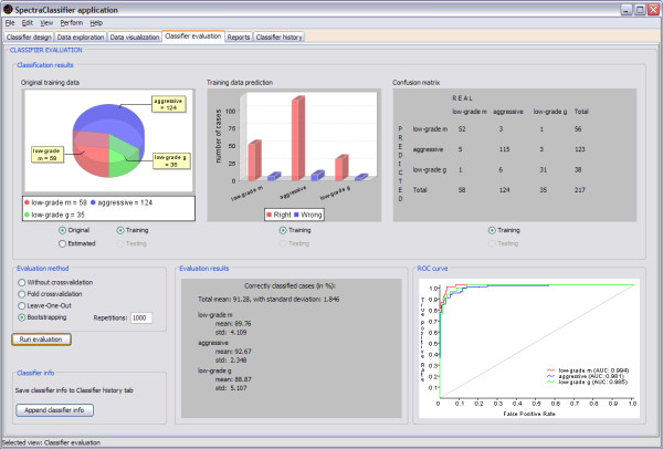
Figure 9.
Classifier evaluation tab. In this example (started in Figure 4), the top left graph is a pie plot that can be used to check the global information of the number of cases that originally belong to each class, and the number of cases that the classifier predicted to belong to each class. The top centre graph is a bar plot used for checking the numerical relationship between rightly (the red ones) and wrongly (the blue ones) predicted cases per class. The top right panel is a confusion matrix, useful for checking predicted cases in each class. For example: the low-grade m class actually contains 58 cases, but the classifier predicts 52 of them as low-grade m, the other 6 are predicted to be aggressive (5) and low-grade g (1). The confusion matrix can also be generated for an independent test set, improving the capabilities of the evaluation. The bottom centre panel shows the bootstrapping results for N = 1000 (a total mean accuracy of 91.28%, with a standard deviation of 1.846%). The bottom right graph is the ROC curve (in the case of a classifier with more than two classes, like the one on this example, data are analysed by dichotomisation [32]), showing the plot of a ROC curve and the AUC value per class.

