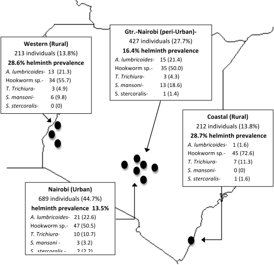
Figure 2. Geographic distribution and prevalence of helminth infection by species and screening region in Kenya.
The black dots represent the relative locations of the ten sites where screening occurred. The number of individuals screened (and percent of total) in each region is listed. The prevalence of helminth infection in each region is listed below in bold. The number of infections for each species and column percents are shown for each region.

